Context
mindful design for the yoga mobile app
Creating space for undisturbed thoughts can be a challenging task in today’s busy life. Yoga is a practice that helps people clear their minds and escape from everyday stress. However, many people don’t have the time or opportunity to regularly visit a yoga instructor, or they need support when practicing yoga on their own. That’s why we were asked to develop the Fresh Yoga app, which blends mindfulness and design to make this favorite form of exercise accessible once again.
client:
location:
sector:
year:
timing:
yoga app
Prague, Czechia
sport & Exercise
2024
4-5 months
CREATION PROCESS
creative concept
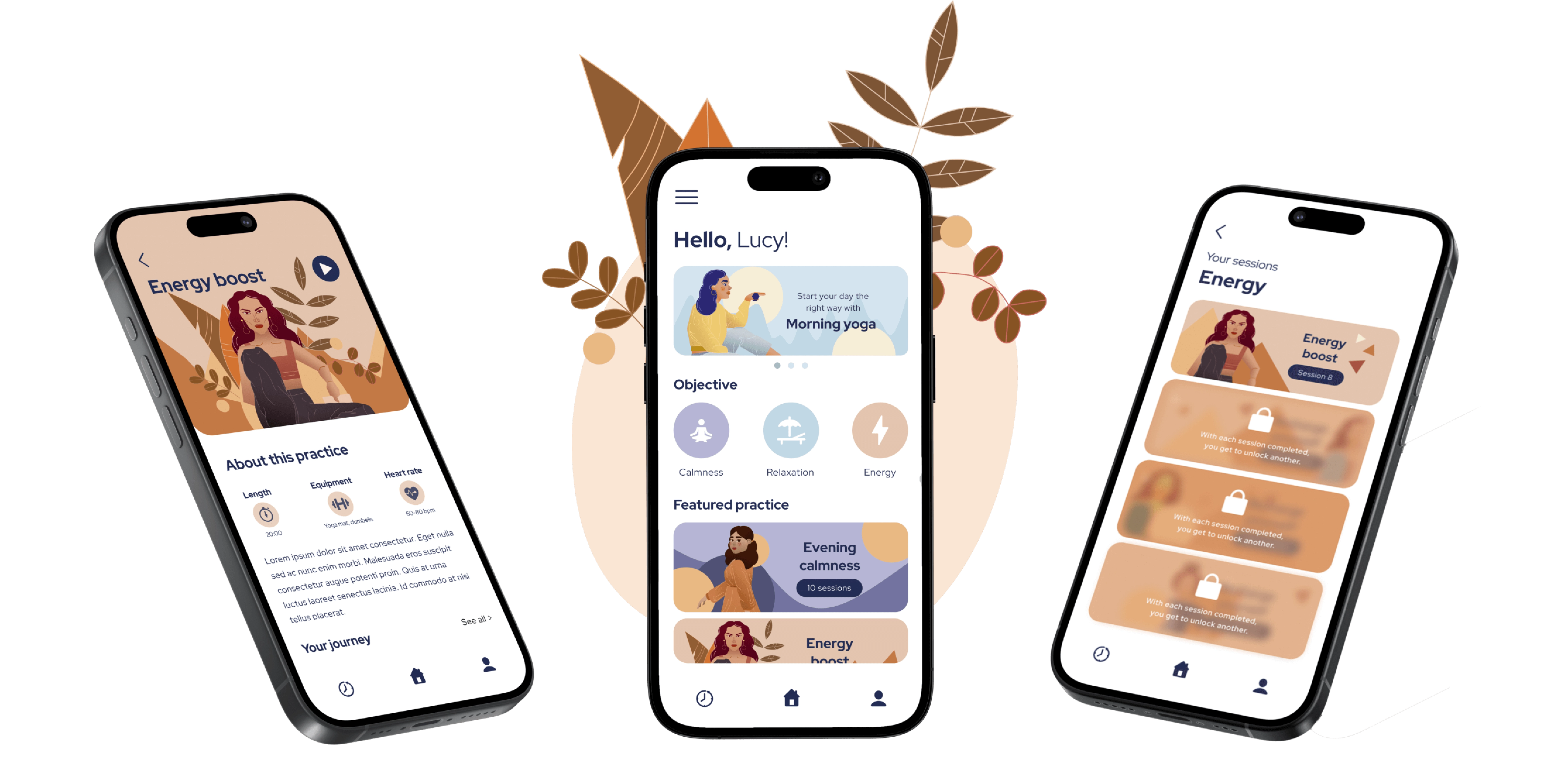
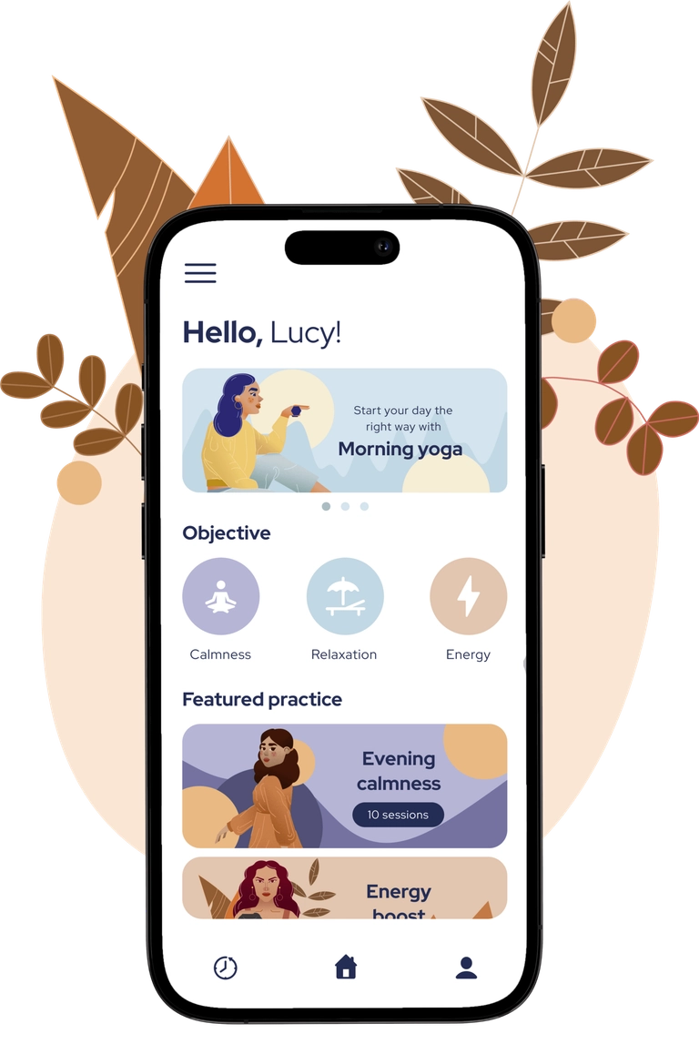
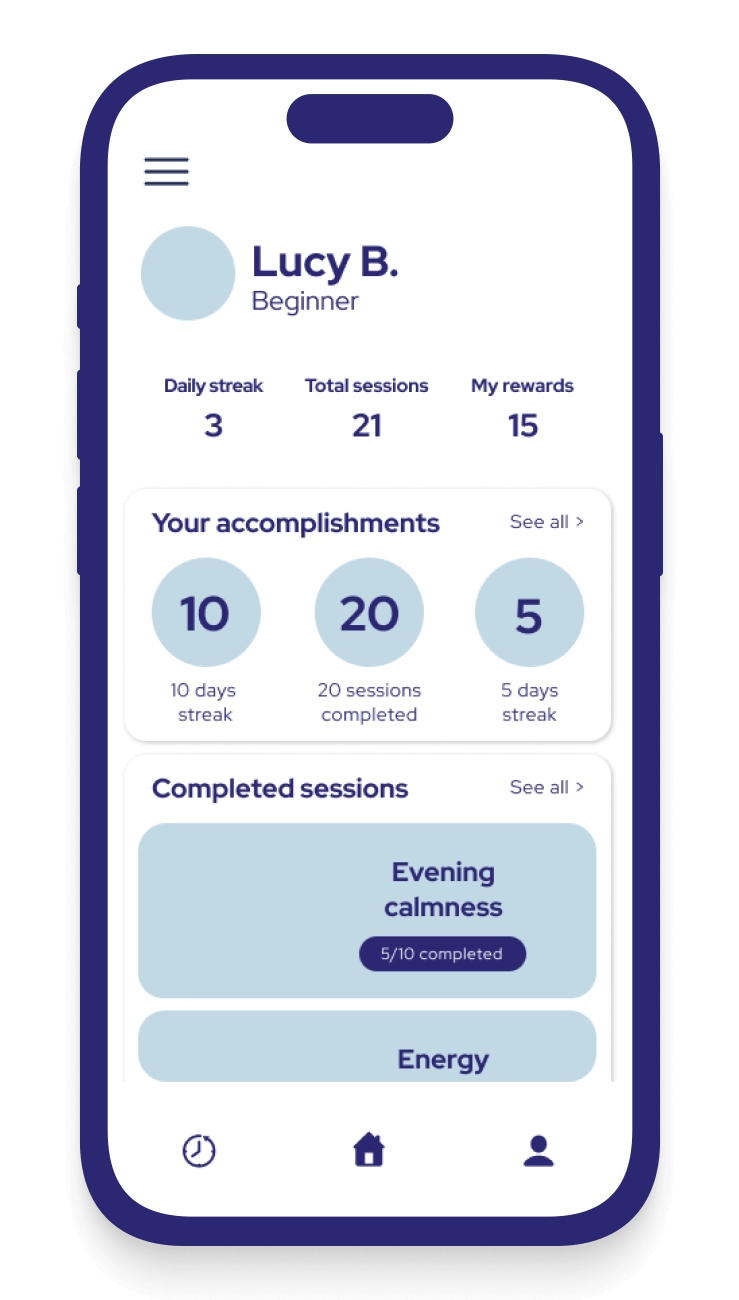
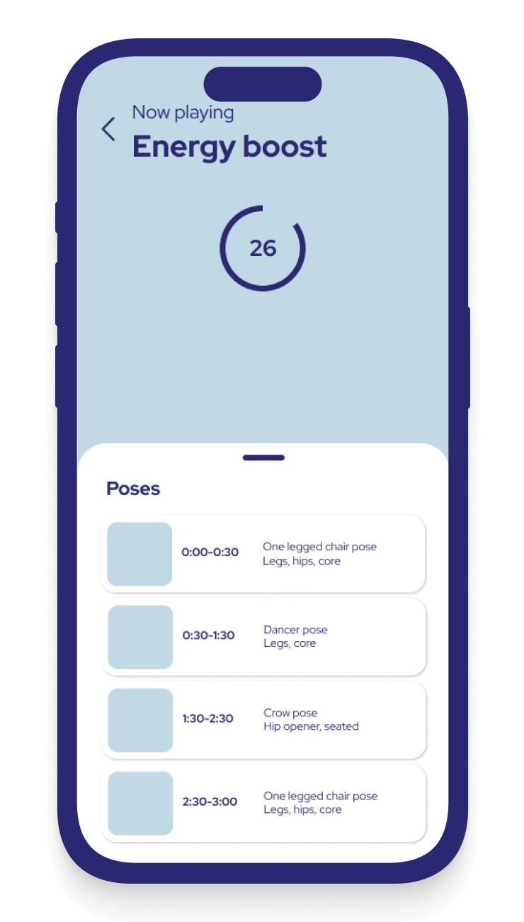
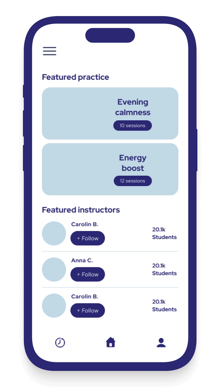
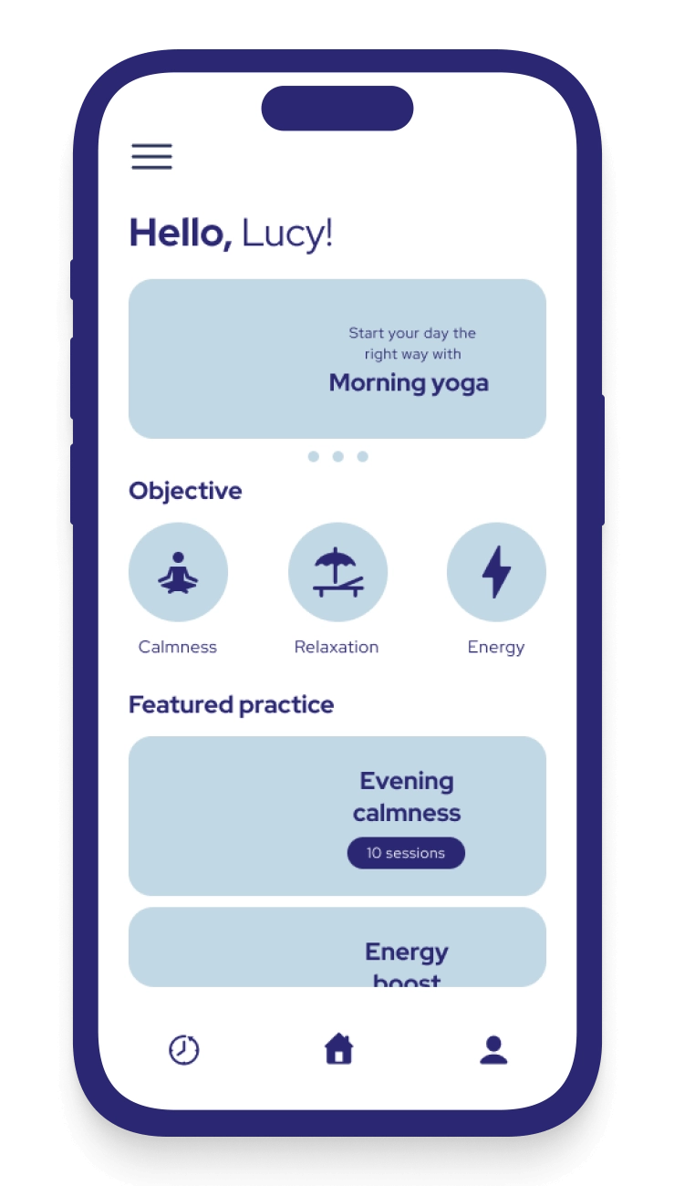
We prioritized user experience in our design concept because we wanted to create an app that’s effortlessly user-friendly for yoga practitioners of all levels.
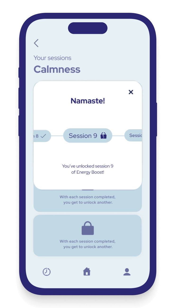
With that in mind, we aimed to craft a seamless experience that guides practitioners on their yoga journey every step of the way, helping them track their progress and evolve.
Moreover, we sought to set the app apart from its competitors by infusing it with calming colors, joy, and a sense of playfulness.
minimalist layouts
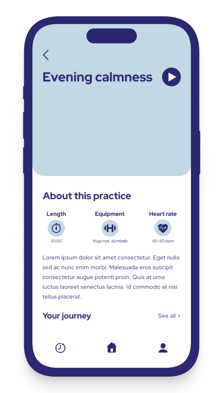
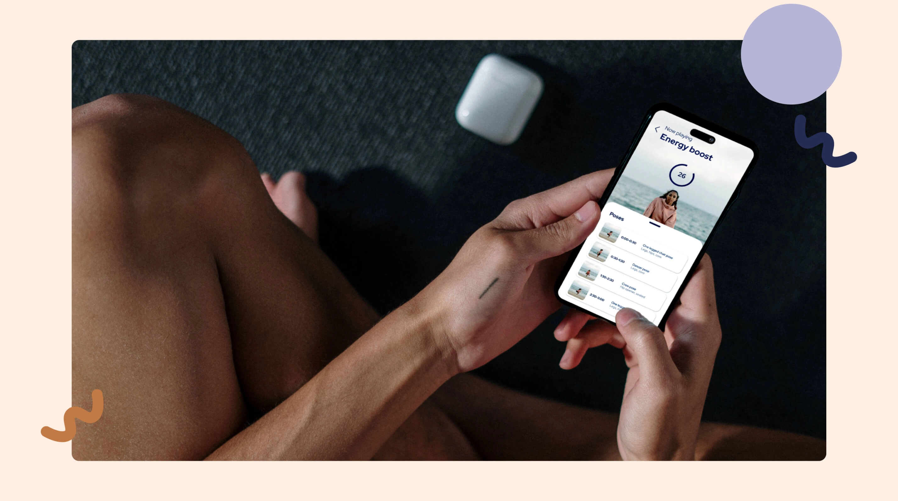
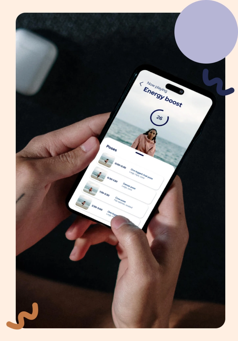
Starting with mapping out the user flows across the entire app, we created the foundation for the project. From there, we designed all layouts with a keen focus on functionality and seamless in-app navigation.
yoga app
yoga app
yoga app
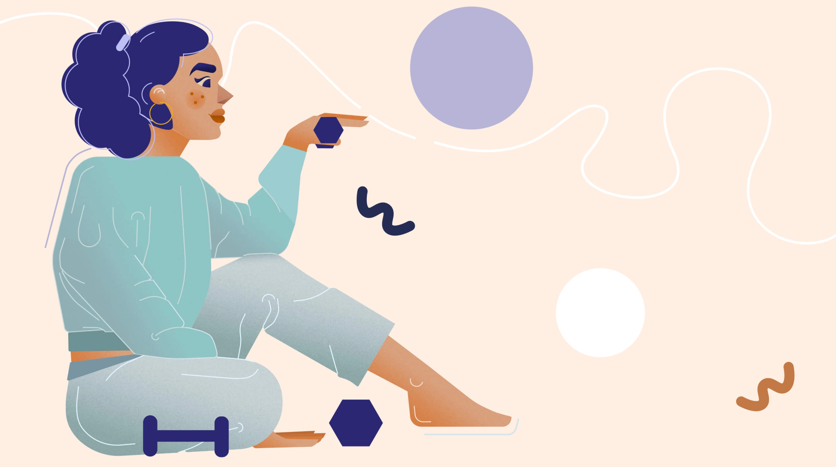
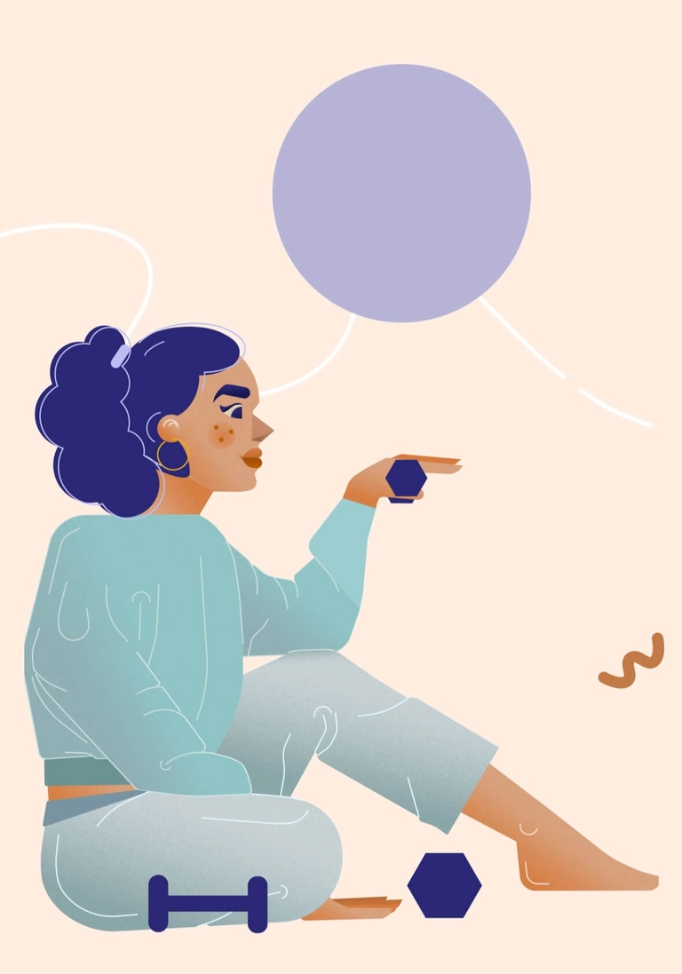
HAND-DRAWN ILLUSTRATIONS
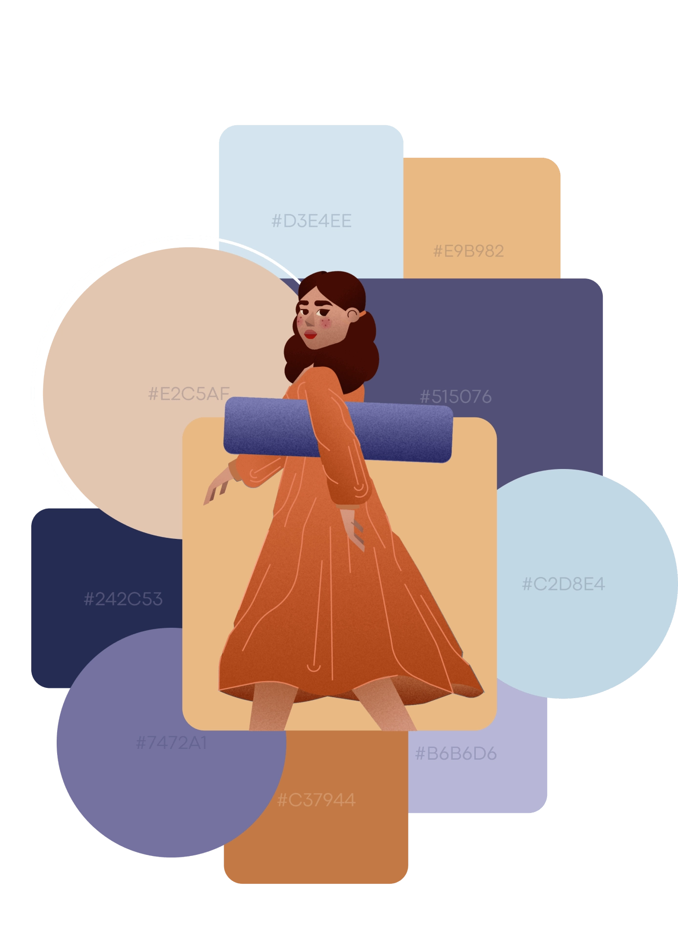
We have breathed life into the project through captivating illustrations, crafting a visual language that ensures an immersive and uniquely personal experience. The yoga app beautifully explores the synergy between design and illustration, making the digital journey not only enjoyable but also visually delightful.


BEHIND THE SCENES
color palette
Our chosen color palette features a harmony of cool and warm tones, which gives the ui a balanced and calming aesthetic.
While shades of blue and lavender evoke a sense of calm and tranquility the Selection of light, airy blues that create a refreshing and serene atmosphere, lastly warm brownish-orange adds an earthy and grounded feel. A neutral beige with a slight pink undertone serves as a subtle background color to balance out bolder hues.
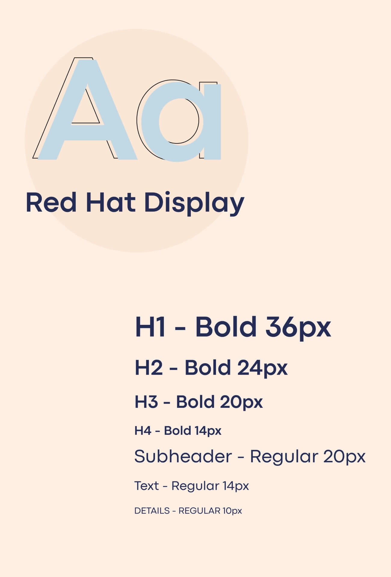
typography
In contrast to the color selection for this project, we chose the Red Head font family — a display typeface that combines boldness with a touch of softness — an excellent choice for a yoga app.
serene
atmosphere
Value
making positive difference
A yoga app that’s as soothing as your favorite pose and as inviting as a deep breath. Through a carefully crafted user flow, we’ve delivered an app that’s not just easy to navigate but genuinely fun. The thoughtful choice of colors together with the hand-drawn illustrations create a welcoming environment that goes beyond functionality — it has a soul. Namaste!